JMU in LA BRANDING GUIDE I contributed to the development of a comprehensive branding guide template for the JMU in LA program, specifically tailored for its Instagram presence. The guide was designed to ensure visual consistency, reflect the program’s creative identity, and enhance audience engagement across social media platforms.

Design Approach
My goal was to create a cohesive and engaging visual language that would resonate with prospective students, alumni, and industry professionals. I ensured consistency across social media graphics, promotional materials, and presentation templates, all while emphasizing clarity, accessibility, and a forward-thinking design aesthetic.
Color Scheme
Typefaces
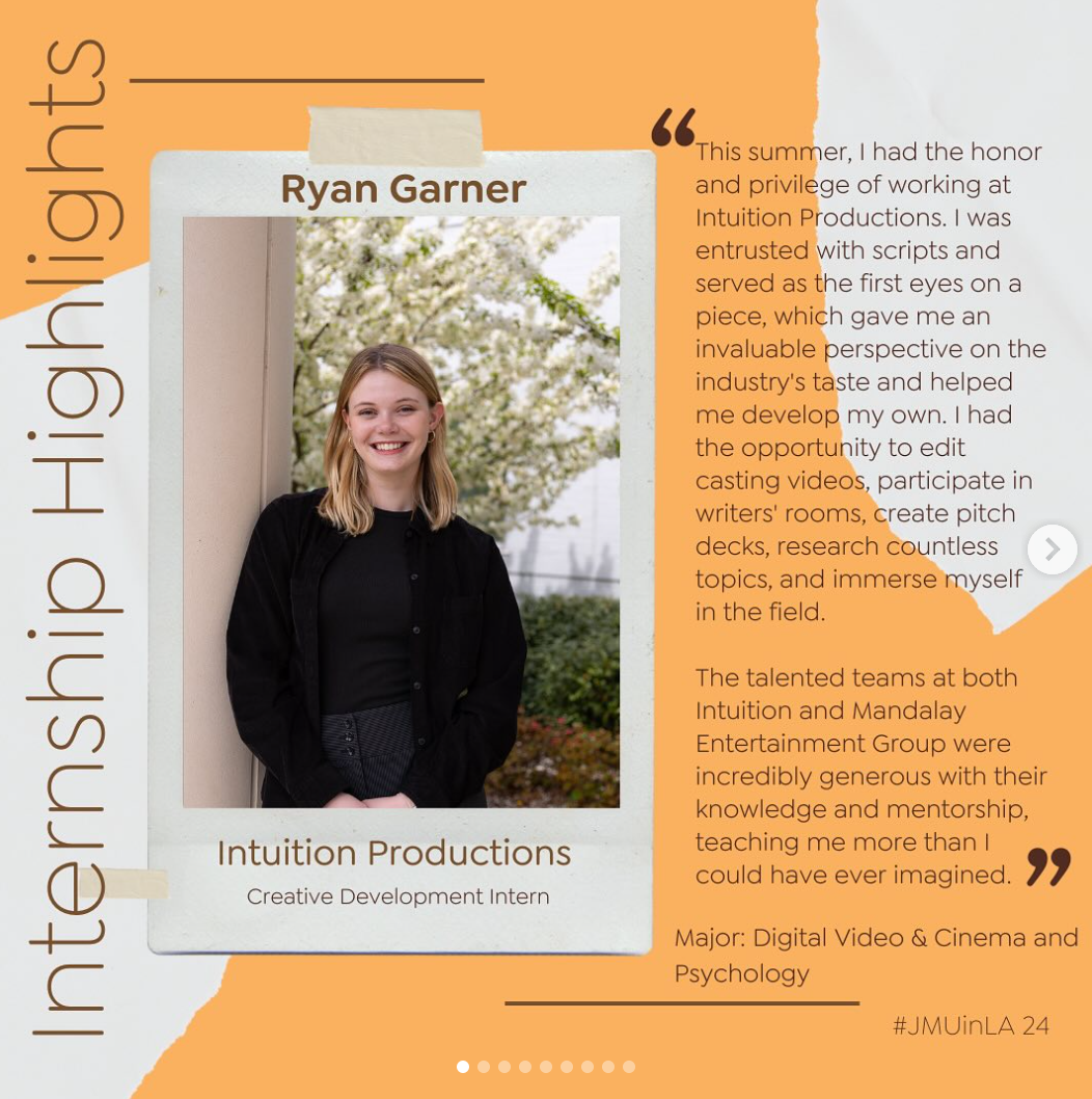
Instagram Post Templates
Templates were thoughtfully crafted to maintain brand consistency while allowing for flexibility across different content types. By unifying typography and color elements, the designs reflect the energy of the Los Angeles experience while staying aligned with the visual identity of James Madison University. The result is a clean, modern, and engaging look that strengthens the program’s recognition and storytelling on Instagram.
To see more designs check out the @jmuinla on instagram


CURIO MAGAZINE BRANDING GUIDE As Editor in Chief of Curio Magazine 2025, I led the creation of the publication’s updated branding guide. I worked closely with the design and editorial teams to define the magazine’s visual identity, voice, and tone. This included overseeing decisions on typography, color palette, logo usage, and brand messaging to ensure a cohesive and compelling look and feel across all platforms.

Design Concept
The design concept reflected in a minimalist layout system, a warm, earthy color palette, and a serif-sans font pairing that bridges tradition with a contemporary edge. . The result is a cohesive identity that reflects Curio’s evolving voice while honoring its core ethos.
A key part of this involved reworking the color palette to reflect the earthy, natural tones of the Shenandoah Valley — rich ochres, muted greens, clay reds, and soft sky blues — bringing a grounded, place-based warmth to the overall aesthetic. This shift created a more authentic visual language that complemented Curio’s storytelling focus on culture, environment, and human connection, while supporting a more immersive and emotionally resonant reader experience.
Final spread designs
A few of the final spread designs for Curio Magazine 2025 reflect a clean, intentional aesthetic rooted in visual storytelling. Inspired by the natural rhythm and textures of the Shenandoah Valley, the spreads incorporate earth-toned accents and soft gradients that guide the eye without overpowering the content.